
Pine Ridge Knit & Sew has been serving the East for 28 years. It is now owned by the third generation in the family, and exists to create a sense of community around a love for sewing, knitting and making. With new family members taking ownership of the shop this year, the owners wanted a fresh new look. We're happy to launch the new Pine Ridge Knit & Sew logo this week. It is a nice mix of geometrics, clean lines, and a splash of hand lettering. We think it turned out pretty sharp! All the best to Pine Ridge Knit & Sew as they venture into this next step of business! Secondary Logo
Process: from the sketchbook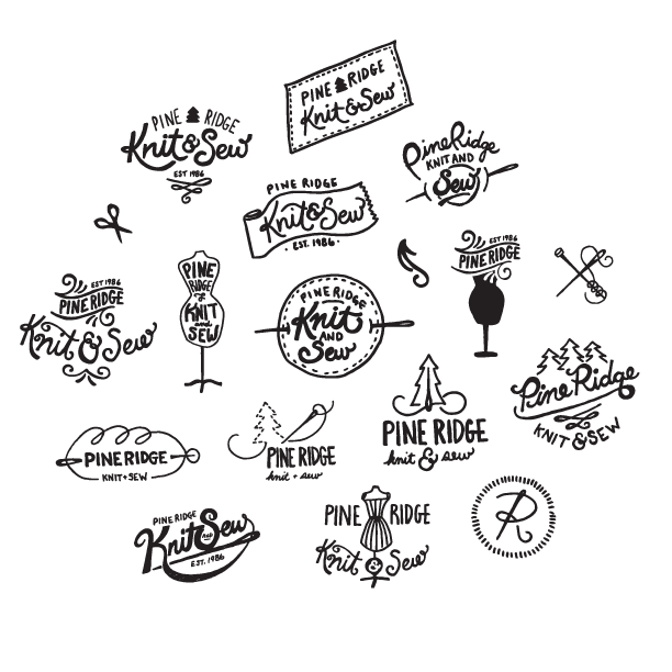
0 Comments

The LogoIf you're a cat person, you'll likely be familiar with the Russian Blue breed. Russian Blue cats are short-haired, and blue-gray in colour. What usually sets them apart from some similar breeds are their green eyes. Yes... I've been learning about cats. Nadine Velten breeds these fuzzy felines, and loves it. She wanted to bring some extra professionalism to her breeding business by branding Dymka Blue Cattery, and we did just that. The icon is more than a little cat staring off into the distance with its back to you, it is also a "D" and a "B" for Dymka Blue. Pretty sneaky, but we're really happy with the results. All the best with your kittens Nadine! From the Sketchbook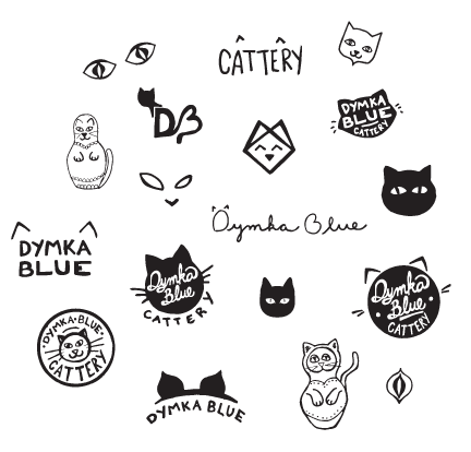
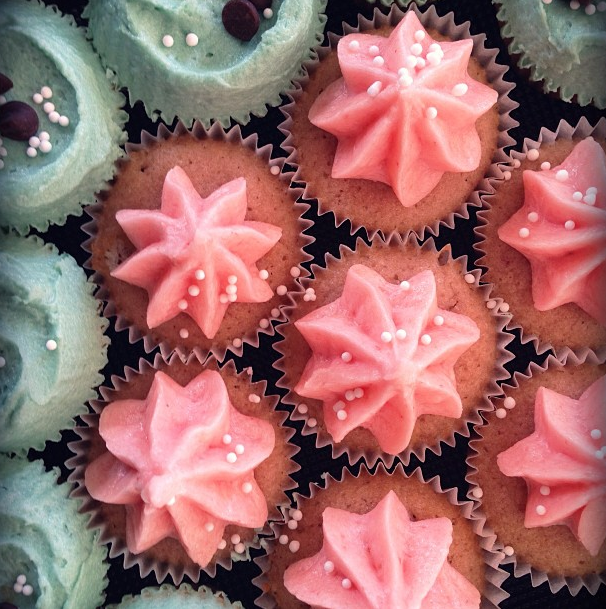
 A huge welcome to Let Them Eat Cakes! A wonderful dessert stand rental service, specially suited for weddings and special events, serving the greater Vancouver area. I have loved working with Sarah and Annette – a mother, daughter duo, to help bring their new business to life. I guess you could say, its a pretty sweet idea. If you are planning a wedding, be sure to work with these ladies for an exquisite looking dessert table! The Logo With its hand-lettered charm, the Let Them Eat Cakes text stands tall, representing a three layer cake. The text rests on a cake stand much like you will find in the Let Them Eat Cakes collection. 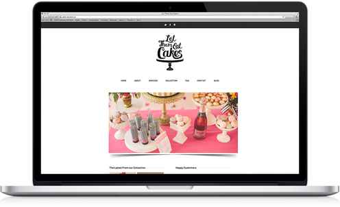 The Website (eatcakes.ca) Clean, simple and easy to navigate, the Let Them Eat Cakes website is full of everything you need to know about dessert stand rentals. Beautiful photographs by The Nickersons contrast the minimalist layout and bring the site to life. Be sure to read the Let Them Eat Cakes news by following their blog!  Elements We created a custom illustrated pattern with all things "sweet" in mind. Perfect for use in print, and on the web, like their twitter page background.
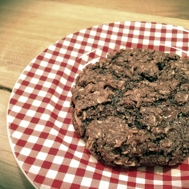
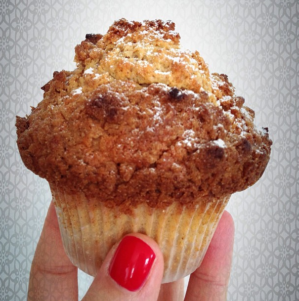
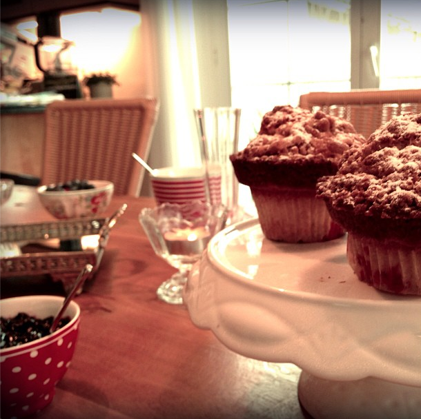
 Tirzah (Tirz) Pfister is a really, really good baker. She lives for it, and you can taste it. She is bringing her passion to life by launching Tirz Bakeshop. Tirzah puts a special touch into every part of her baking – quality ingredients, melt-in-your-mouth taste and exquisite presentation. Tirzah lives in Zurich, Switzerland and we were so happy to be able to work with her while she was visiting Canada. Tirz has an eye for beautiful aesthetics – beyond her sweet creations – which makes her a delight to work with. We explored quite a few different avenues for the Tirz Bakeshop logo brand. It had to be timeless, legible and appeal to a wide range of age groups. Hand lettering was a must, and we decided on a custom hand lettered slab-serif – friendly and not too trendy. We look forward to seeing how her packaging turns out – gold foiling! Yes! From the sketch book...  A secondary graphic was created to use as a sub-logo within the brand. We produced a rubber stamp for packaging to give that real made-from-scratch feel. Rubber stamps are... awesome.  Keep up with Tirzah on instagram ( tirzahpfister) to drool over her baked goods! |
Kayla EnglishHappily married to a handsome fellow named Tylor, she is a graphic designer, paper lover, hobby crafter, culinary adventurer and an all-round creative enthusiast. Archives
July 2014
Categories
All
|


 RSS Feed
